It’s been said a picture is worth a thousand words. And such is the case when it comes to analyzing financial data. In Bukers Taxanalysis, there’s no better visual than our customizable charts. With these charts you can view the specific data you want to see side by side to get a better grasp of your borrower’s financials.
Read on to find out how to customize them in Bukers Taxanalysis!
Chart Types
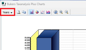
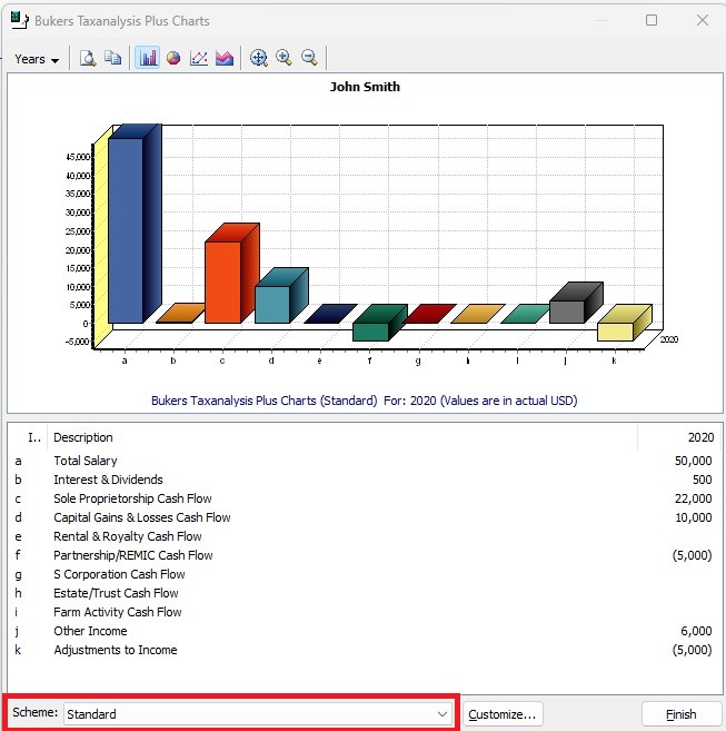
To see charts based on your borrower’s financial data, click on the Charts button at the bottom right of the screen.
The default chart is the column chart. You also have 3 other chart types to choose from: Pie, Line and Area. Choose the type of chart you want by clicking on the button that displays a picture of the one you would like to use. These buttons are found at the top left of the screen.
Chart Schemes and Data
The data for the default chart is for the first year of your spread. If you would like to see additional years, you can select them by clicking on the “Years” button at the top left of the screen.
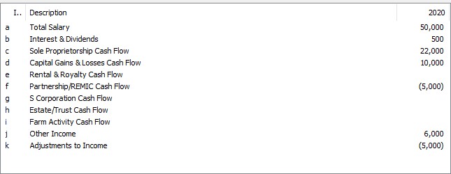
The default or “Standard” chart scheme includes Salary, Wages, Etc., all of the tax return schedules (B through F), plus Other Income and Other Adjustments to Income. These are the main recap page items. But what if you want to see sub-worksheet items? Or maybe you want to see some of these, but not others?
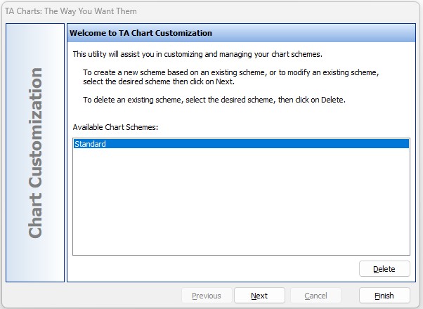
To change which data is shown, click on the Customize button at the bottom of the screen. You will be asked to choose an existing scheme to modify.
If this is the first time the chart for your borrower has been modified, the only choice you will see is “Standard.” Select the scheme and click the Next button.
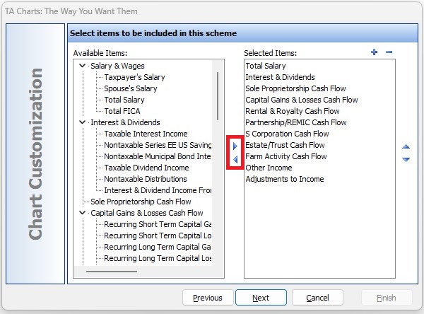
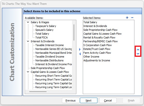
You are now at the screen where you can pick and choose which data to display in your chart. On the right are the items that are currently displayed. On the left are all available items.
To remove an item from the right side, select it by clicking on it then click the little arrow in the center of this screen that points to the left. To add an item that you would like to have displayed in your chart, select the item from the left side, and click the little arrow that points to the right.
Display of Data
You can also order the way the items in your chart are displayed. To do this, select the item you want to move, then select the little arrow on the right side of the screen that points up to move the item up in the list. Or click the little arrow on the right side of the screen that points down to move the item down in the list.
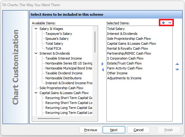
Suppose you want a positive chart item to display as negative, or vice
versa? Select the item from the list on the right, then select either
the plus sign or the minus sign at the top of the list.
Saving Your Customization Scheme
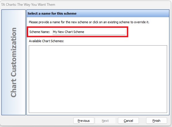
When finished customizing the items to display in your chart, click the Next button and provide a new Scheme name for your customized chart.
Please note, you can base a new scheme off of the “Standard” scheme, but to save it you must provide a new name. If you are customizing a scheme that was previously created, you can overwrite the scheme with your changes.
Click the Finish button and your chart will be updated to show your changes. You can go back and view other schemes including the “Standard” scheme by selecting it from the list at the bottom of your screen to the left of the Customize button.
Get the complete picture of your borrower’s financials and include your customized charts in your loan write-ups!
If you would like assistance with this or any feature of Bukers Taxanalysis or Bukers BTA, please don’t hesitate to give us a call at (503) 520-1303.